Create Your Visual Brand Identity
Module 1, “From your words to a visual language”, free to watch for 72 hours.
Watch the replayGet the replay by email
About 22 minutes, in 7 short segments. You’ll have 72 hours from the moment you first open it. If you buy Brand Discovery with AI, this module comes with it, along with the rest of its three courses, and you keep them for life.
Already signed up? Open the link in your welcome email.
Inside this module
- ✓Welcome — why this course exists.
- ✓You already have a look.
- ✓Your brand kin, as a visual on-ramp.
- ✓Two directions, and finding your no.
- ✓One direction, and finding your yes (your Moodboard).
- ✓Color, starting from the feeling.
- ✓Between now and the next module.
Your replay
Your replay is open until … (your time).
Two ways through this module
Use either one, or both. Each remembers your place.
Click on any of the options above.
0:00 of 21:30
Pick up where you left off: …
Module 1’s Lessons:
1.0 · Welcome — why this course exists
Video · 3 min
Key points from the video
- George made this course because he needed it himself. Before AI, he updated his website about once a decade: too frugal to hire a designer, too lazy to do the branding work, so he left it alone for years at a time.
- His before picture: 22 course covers, roughly ten different visual treatments, six or seven typefaces. "Each one made with care at the time. Together they look like ten different businesses." No brand coherence, no visual coherence; he had been winging it for seventeen years.
- Why now and not in any of the last seventeen years: "What changed is the price of it." Brand work used to be expensive or slow or both (a designer, a discovery process, weeks of back and forth). Now it is an afternoon with an AI, and re-runnable whenever you have changed.
- AI put the course together, then he ran it on himself, doing every exercise alongside students for the first time.
- Why it is worth doing: coherence reduces friction for the people who already want to believe you; visual incoherence continually erodes trust. Every mismatched cover and off-key color spends a little of the trust you would otherwise have. He had been paying that quietly since 2009. He thinks every business should do this work now.
- Showing up as you are is legitimate. A person wrote to his website's AI assistant that polished branding feels intimidating because she is not "Internet shiny" and wants more people to see what regular people look like. George will not talk anyone out of that; it is a real position held on purpose.
- This course is for a different moment: when you want your look to stop working against what you are offering. Another person put that side well: the look "needs to convey the mastery that is behind all this" so it does not look cheap.
- The permission, same as the previous two courses: try on a look the way you try on clothing, nothing locks you in; your visual identity is a snapshot, not a vow, revised as you grow; nothing goes public until you want it to, and most of what gets made is for your own clarity first.
- Destination, by the end of Module 2, a small brand kit that is genuinely yours:
- A visual direction you can describe in a sentence
- A color palette with actual hex codes
- A font pairing
- An imagery style
- A wordmark
- A one-page style guide that holds it all, plus three ready-to-use assets
- Module 1 builds the visual vocabulary (direction, palette); Module 2 makes the assets.
- Practical setup: keep a single AI chat (or one AI project) open for the whole course. Every lesson hands the next one its material, so staying in one session means never re-explaining: it already has your reactions, your brand kin, your not-me list. "One long conversation, six lessons."
The full lesson text (click to show)
Before AI, I didn’t update my website except, like, once every decade.
Really. I was too frugal to hire a designer, and too lazy to do the branding work. So I left it alone, for years at a time.
What that looks like after seventeen years
Here are my own course covers. Twenty-two of them.
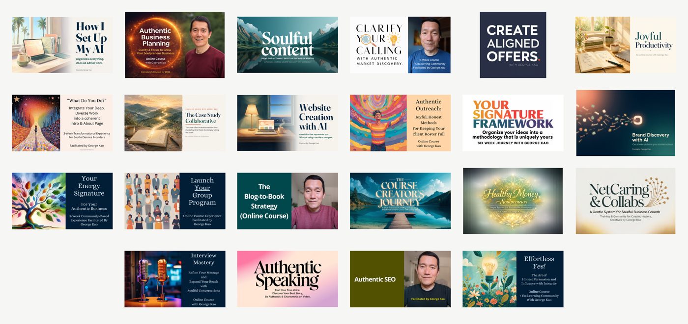
- Roughly ten different visual treatments, and six or seven different typefaces.
- Each one made with care at the time. Together they look like ten different businesses.
That’s my “before” picture, and I’d guess it’s a familiar starting point for anyone who’s been at this a while.
Why now, and not in any of the last seventeen years
I’ve been avoiding this work my whole business life. What changed is the price of it. Brand work used to be expensive, or slow, or both — a designer, a discovery process, weeks of back and forth. Now it’s an afternoon with an AI, and you can run it again whenever you’ve changed.
AI put this course together for me, and then I ran it on myself. I’m doing every exercise here alongside you, for the first time.
It’s worth doing because coherence reduces friction for the people who already want to believe you. Every mismatched cover and off-key color spends a little of the trust you’d otherwise have. I’ve been paying that quietly since 2009.
Showing up as you are is a legitimate choice
Someone wrote in to my website’s AI assistant a while back, and said it better than I could:
“They all feel a little intimidating because I’m not Internet shiny... I don’t have the Internet aesthetic. I look like I’m low income... There’s a part of me that just wants to show up as is anyway, because I think more people need to see what regular people look like.”
She’s right, and I’m not going to talk anyone out of that. Showing up as you are is a real position, held on purpose by people I respect.
This course is for a different moment: when you’d like your look to stop working against what you’re offering. Someone else described that side well — “it needs to convey the mastery that is behind all this... so it doesn’t look cheap, if you know what I mean?”
The permission, same as the previous two courses
- Try on a look the way you try on clothing. Nothing here locks you in.
- Your visual identity is a snapshot, not a vow. You’ll revise it as you grow.
- Nothing goes public until you want it to. Most of what we make is for your own clarity first.
Where we’re headed
By the end of the second module you’ll have a small brand kit that’s genuinely yours:
- A visual direction you can describe in a sentence
- A color palette with actual hex codes
- A font pairing
- An imagery style
- A wordmark
- A one-page style guide that holds it all, plus three ready-to-use assets
This module builds your visual vocabulary — direction, palette. The next one makes the assets.
One practical thing before you start: keep a single AI chat open for the whole course. Every lesson hands the next one its material, so if you stay in the same session you never re-explain yourself — it already has your reactions, your brand kin, your not-me list. One long conversation, six lessons.
Share in the Student Discussion doc: where are you with visual branding right now — avoiding it, halfway through a redesign, somewhere in between? 🙏🏼
1.1 · You already have a look
Video · 6 min
Key points from the video
- Your aesthetic is already implied by what your clients feel in your presence and by what you stand for. You are translating something that exists, not inventing from nothing.
- Optional input: the Evidence file from Discover Your Brand Strengths. The sensory words clients used about you (calm, warm, grounded, spacious, no-nonsense) are already visual instructions. The exercise works from scratch without it.
- What stops most people is not lack of taste but too many possible answers.
- A student's version: struggling with brand colors, unsure whether colors should be what she likes or what fits the target audience, overwhelmed by possibilities. Another, in five words: "I am afraid to make the wrong decisions."
- That is a decision problem rather than a talent problem, which is good news: decision problems have methods.
- You are already good at this in one direction. You know within about two seconds when a website feels off (cluttered, dated, trying too hard, not quite trustworthy). That is taste running in recognition mode instead of production mode.
- "Almost nobody can generate a visual direction from a blank page. Almost everybody can react to one."
- Reacting needs something in front of you, which used to mean hiring someone and now takes an AI minutes to draft. George has no design or photography training and found the exercise works anyway: you already know what attracts you and what puts you off.
- Exercise: react to three real pages. No design vocabulary needed, only opinions.
- Something you made: your website if you have one, otherwise your most recent flyer, slide deck, social post, book cover or email header.
- A nichemate's website, someone doing work close to yours.
- One more of either kind, picked because looking at it gives you an opinion.
- For each: what feels like me and what doesn't; what do I like about how it looks and what bothers me.
- Plain words are the right words: "Too busy." "Feels cold." "That photo doesn't look like anyone I'd call." "I like how much empty space there is."
- Judging your own work is hard and judging someone else's is easy, and the reactions you have to theirs are still yours. If the thing you use was made with AI, reacting against it is the point: pushing back on what an AI hands you keeps your own discernment sharp and keeps your energy signature yours, instead of drifting toward whatever the model happens to like.
- Talk it, don't type it. Record a two- or three-minute screencast of yourself scrolling those pages and saying what you think, moving your cursor to whatever you are talking about (George's video suggests the length can run to five or ten minutes).
- Options: your computer's screen recorder; a phone's screen-record button, or even a phone video of the screen with a finger pointing at the parts; or start a video meeting with yourself, share your browser and record.
- Nobody sees this recording. It exists so your AI can read your taste back to you. You will say more out loud in two minutes than you would type in twenty. AI will wait however long you pause.
- Hand the recording to your AI with a prompt that asks three things: (1) list what I reacted to, positively and negatively, quoting my own words; (2) describe each page's visual style in plain non-designer language (colors and where they are used, how much empty space, what the type feels like, kind of imagery, the mood in one sentence); (3) tell me what my reactions suggest about my taste, what I seem drawn to and what I avoid. Doing this also primes the AI to start the work with you.
- If your AI cannot take video, screenshot each page, attach the images and type your reactions. Same three requests, same result.
Thank you — you’re good at putting words to things people can see but can’t name, and I appreciate that.
Attached is a short screen recording of me looking at a few web pages and saying out loud what I like and dislike about how they look.
Three things, please.
1. List what I reacted to, positively and negatively, quoting my own words where you can.
2. Describe each page’s visual style in plain, non-designer language: the colors and where they’re used, how much empty space there is, what the type feels like, what kind of imagery, and the mood in one sentence.
3. Tell me what my reactions suggest about my own taste — what I seem drawn to, and what I seem to avoid.
Thank you. - What you keep: two short lists, what feels like me and what doesn't. That is the first draft of your visual direction.
The full lesson text (click to show)
Your aesthetic is already implied by what your clients feel in your presence and by what you stand for. We’re translating something that exists, not inventing from nothing.
Bring your Evidence file, if you have one
If you built one in Discover Your Brand Strengths, open it now and skim for the sensory words your clients used about you — calm, warm, grounded, spacious, no-nonsense.
Those are already visual instructions, and they’ll sharpen everything in this lesson and the next four.
And if you don’t have it, nothing here depends on it — the exercise below works from scratch.
The thing that stops most of us
Almost nobody gets stuck because they lack taste. They get stuck because there are too many possible answers.
Someone asked my AI assistant this, and it’s the clearest description of the block I’ve read:
“I am struggling with my brand colors, how did you find yours? There are so many possibilities that I am confused. Should the colors be what I like, or what fits with the targeted audience... I just had the thought of having one neutral...”
And from someone else, in five words — “I am afraid to make the wrong decisions.”
That’s a decision problem rather than a talent problem, which is genuinely good news. Decision problems have methods, and we’re about to use one.
You’re already good at this, in one direction
You know within about two seconds when a website feels off. Cluttered, dated, trying too hard, not quite trustworthy.
- That’s taste, running in recognition mode instead of production mode.
- Almost nobody can generate a visual direction from a blank page. Almost everybody can react to one.
- Reacting needs something in front of you to react to — which used to mean hiring someone, and now takes an AI minutes to deliver a draft to you.
👀 The exercise: react to three real pages
You don’t need design vocabulary for this. You need opinions, and you already have those.
Open three things:
- Something you made. Your website if you have one — otherwise your most recent flyer, slide deck, social post, book cover, or email header.
- A nichemate’s website. Someone doing work close to yours.
- One more of either kind, picked because looking at it gives you an opinion.
For each one: what here feels like me, and what doesn’t? What do I like about how it looks, and what bothers me?
Plain words are the right words. “Too busy.” “Feels cold.” “That photo doesn’t look like anyone I’d call.” “I like how much empty space there is.” “The green is nice, the gold is trying too hard.”
Judging your own work is hard; judging someone else’s is easy — and the reactions you have to theirs are still yours.
If you use something you made with AI, reacting against it is the point. Getting in the habit of pushing back on what an AI hands you is how your own discernment stays sharp — how your energy signature stays yours, instead of drifting toward whatever the model happens to like.
🎥 Talk it, don’t type it
The fastest way through this, and the one I’d recommend: record a two- or three-minute screencast of yourself scrolling those pages and saying what you think, moving your cursor to whatever you’re talking about.
Mac: Shift-Cmd-5. Windows: Win-Alt-R. On a phone, your screen-record button — and pointing with your finger works as well as a cursor.
A third way, if neither of those is familiar: start a Zoom meeting with yourself, share your browser screen, and hit record. Most of us already know how to do that one.
Nobody sees this recording. It exists so your AI can read your taste back to you — it is never published, and there is nothing to make it presentable for.
Then hand the recording to your AI:
Thank you — you’re good at putting words to things people can see but can’t name, and I appreciate that.
Attached is a short screen recording of me looking at a few web pages and saying out loud what I like and dislike about how they look.
Three things, please.
1. List what I reacted to, positively and negatively, quoting my own words where you can.
2. Describe each page’s visual style in plain, non-designer language: the colors and where they’re used, how much empty space there is, what the type feels like, what kind of imagery, and the mood in one sentence.
3. Tell me what my reactions suggest about my own taste — what I seem drawn to, and what I seem to avoid.
Thank you.
You’ll say more out loud in two minutes than you’d type in twenty.
On video: Gemini takes video files directly — up to five minutes on the free plan, an hour on a paid one, so two or three minutes is safe. Other tools vary and keep changing.
If yours won’t take the file, screenshot each page instead, attach the images, and type your reactions into the chat. Same three requests, same result.
What you keep: two short lists — what feels like me, and what doesn’t. That’s the first draft of your visual direction.
Go ahead and do this now, before the next lesson 🙏🏼
1.2 · Your brand kin, as a visual on-ramp
Video · 3 min
Key points from the video
- Brands you love already carry a full visual vocabulary. Borrowing the feeling of one is not copying; it is the fastest way to give an AI something it can render.
- Two roads. If you ran the brand-kin prompt from the previous course's lesson on the one trait worth borrowing, attach what came back and tell your AI to skip the questions and synthesize straight from those answers. If you did not (the common case), the three-minute self-interview below is the main road. Attach your Brand Compass or brand brief too if you have one; the AI interviews far better with your own words on screen.
- "Brands" means any kind of product or place you know well; asked in the abstract most of us go blank, so pick from what you actually use and enjoy:
- something you buy regularly (food, drink, household, skincare)
- a shop, café, restaurant or hotel you like walking into
- a tool or app you open every day
- a car, bicycle, kitchen thing or piece of furniture
- a magazine, newspaper, publisher or podcast
- a clothing label, if you pay attention to clothes
- a musician or band whose albums have a look
- a public figure or influencer whose whole presentation hangs together
- If no brand comes to mind, use places: a particular café, a library you love, your grandmother's kitchen. Each has a look and you know how it feels.
- The self-interview prompt: the AI interviews you before suggesting anything, asking three questions one at a time and waiting for each answer: (1) How do you want people to feel in your presence? (2) Name three brands, products or places you know well that you would happily live inside. (3) Name three you would never. Then it gives two or three distinct visual directions, each with a short name and two or three sentences on ground color, how much empty space, how the type feels and what imagery belongs. Specific and concrete, not a list of adjectives.
Thank you for doing this with me — you’re good at hearing what someone means underneath what they say, and I’m grateful for that.
I’m working out the visual direction for my business, and I’d like you to interview me before you suggest anything. Ask me these three questions, one at a time, and wait for my answer before moving on:
1. How do you want people to feel in your presence?
2. Name three brands, products or places of any kind — ones I know well — that I’d happily live inside.
3. Name three I’d never.
Then take my answers and give me two or three distinct visual directions. For each one: a short name, then two or three sentences covering the ground color, how much empty space there is, how the type feels, and what kind of imagery belongs. Be specific and concrete rather than giving me a list of adjectives. - One extra line worth adding: before it writes the directions, have it first give eight one-line directions as different from each other as it can make them, including one that sounds like it could not possibly work for you, and wait for your reaction before developing any.
- Why: an AI's first few ideas sit close together, and they are the same first few ideas everyone else gets. A wide, shallow list costs nothing, and your two-line reaction (what you pictured, what felt tacky, what is missing) is a better brief than the interview was.
- Then: develop the two or three closest to my reaction.
First give me eight one-line directions, as different from each other as you can make them — include one that sounds like it couldn’t possibly work for me — and wait for my reaction before developing any.
Now develop the two or three closest to my reaction.
- You are not repeating the previous course. That prompt unpacked each brand individually, one trait at a time; this one synthesizes them into a visual direction, a different output built from the same material. If you did the earlier work you are spending it here, not redoing it.
- Two things that go wrong: you get six options instead of two or three (reply "Cut this to your best two, fully described."); the directions all sound the same, usually because it has too little to work with (give it your two lists from lesson 1.1 plus one sentence about who your clients are).
Cut this to your best two, fully described.
- George's own four, one trait each: Mister Rogers, calm that regulates rather than calm as a manner; Bob Ross, hands over the exact technique and turns the mistakes into part of it; Khan Academy, ungated and expects you to leave; Muji, utility with nothing wasted.
- It was five until he cut Julia Child once he noticed Bob Ross already covered that ground and covered it better, which is what a kin list should do over time: get shorter and sharper.
- Caveat: Muji is internal scaffolding for him, not public copy. He chose it over IKEA knowing most Americans would not recognize the name. Fine for briefing an AI, wrong for a sales page: borrowed clarity only works publicly with brands people already know. So there are two kinds of kin, the ones you say out loud and the ones that are just for you and your AI.
The full lesson text (click to show)
Did you run the brand-kin prompt from the previous course’s lesson on the one trait worth borrowing?
- If you did — attach what came back to the prompt below, and tell your AI to skip the questions and synthesize straight from those answers.
- If you didn’t — that’s the common case, and we’ll get you there in about three minutes right now. This is the main road through the lesson.
The three-minute self-interview
Brands you love already carry a full visual vocabulary. Borrowing the feeling of one isn’t copying — it’s the fastest way to give an AI something it can render.
“Brands” here means any kind of product or place you know well. Asked in the abstract, most of us go blank — so pick from what you actually use and enjoy:
- something you buy regularly: food, drink, household, skincare
- a shop, café, restaurant or hotel you like walking into
- a tool or app you open every day
- a car, a bicycle, a kitchen thing, a piece of furniture
- a magazine, newspaper, publisher or podcast
- a clothing label, if clothes are something you pay attention to
- a musician or a band whose albums have a look
- a public figure or influencer whose whole presentation hangs together
And if no brand comes to mind at all, use places instead. A particular café, a library you love, your grandmother’s kitchen — they each have a look, and you already know how they feel.
Paste this into your AI:
Thank you for doing this with me — you’re good at hearing what someone means underneath what they say, and I’m grateful for that.
I’m working out the visual direction for my business, and I’d like you to interview me before you suggest anything. Ask me these three questions, one at a time, and wait for my answer before moving on:
1. How do you want people to feel in your presence?
2. Name three brands, products or places of any kind — ones I know well — that I’d happily live inside.
3. Name three I’d never.
Then take my answers and give me two or three distinct visual directions. For each one: a short name, then two or three sentences covering the ground color, how much empty space there is, how the type feels, and what kind of imagery belongs. Be specific and concrete rather than giving me a list of adjectives.
And if you have your Brand Compass or brand brief, attach it. The AI will interview you far better with your own words on the screen.
One extra line, and it’s worth it
Before it writes the two or three directions, add one instruction:
First give me eight one-line directions, as different from each other as you can make them — include one that sounds like it couldn’t possibly work for me — and wait for my reaction before developing any.
An AI’s first few ideas sit close together, and they’re the same first few ideas everyone else gets. A wide, shallow list costs nothing — and your two-line reaction to it (what you pictured, what felt tacky, what’s missing) is a better brief than the interview was.
Then:
Now develop the two or three closest to my reaction.
You’re not repeating the previous course
That prompt unpacked each brand individually, one trait at a time. This one synthesizes them into a visual direction — a different output, built from the same material. If you did the earlier work, you’re spending it here rather than doing it again.
Two things that go wrong here
- You get six options instead of two or three. Reply:
Cut this to your best two, fully described.
- The directions all sound the same. Usually means it has too little to work with. Give it your two lists from the previous lesson — what feels like you and what doesn’t — plus one sentence about who your clients are.
Mine, as an example
My four, one trait each:
- Mister Rogers — calm that regulates, rather than calm as a manner
- Bob Ross — hands over the exact technique, and turns the mistakes into part of it
- Khan Academy — ungated, and it expects you to leave
- Muji — utility with nothing wasted
It was five until recently. I cut Julia Child once I noticed Bob Ross already covered that ground and covered it better, which is what a kin list is supposed to do over time — get shorter and sharper.
One caveat worth saying out loud. Muji is internal scaffolding for me, not public copy. I chose it over IKEA knowing that most Americans wouldn’t recognize the name. Fine for briefing an AI, wrong for a sales page — borrowed clarity only works publicly with brands people already know.
So you get two kinds of kin: the ones you say out loud, and the ones that are just for you and your AI.
You’ve just seen directions you might like. Next we find your dealbreakers — by looking at one you won’t.
Comment in the Student Discussion doc with the name of one visual direction your AI gave you, and whether it felt close. 🙏🏼
1.3 · Two directions, and finding your no
Video · 3 min
Key points from the video
- Two lessons, two opposite jobs: this one finds your no, the next finds your yes. It breaks the decision paralysis from lesson 1.1, and it works even if you could not name your taste directly.
- Starting with the no is not a detour. What repels you narrows the field far faster than what attracts you, and it is much easier to feel: the no arrives in about a second, while the yes usually takes a few tries.
- Why generate images instead of describing them: if an AI hands you a paragraph describing a visual direction, you are still the one doing the imagining, the exact thing lesson 1.1 says you cannot easily do. So make the pictures and react to them. George learned this the hard way: the first version of this lesson was text only and did not work, for a reason his own earlier lesson had already explained.
- The move: ask an AI to pick a visual direction for you, confidently, with no options and no hedging, and render it as an actual image. Then do it a second time with a deliberately different direction.
- Some of it you will like; some will produce a small immediate "no, that's not me." That no is what we are here for. "Dissonance is data."
- Two generations, then stop. Do not improve either; refining is the next lesson's whole job and doing it here is how you run out of afternoon. It is the same contrast principle as in Your Energy Signature, pointed at the visual layer.
- React the moment the image appears. Give it thirty seconds and you get used to it, the image stops being new and the no goes quiet. Whatever comes up in the first few seconds is the honest answer.
- You need an AI that can make pictures; if your usual assistant only writes text, open a second tab for this one (you will want it again in the next lesson).
- The prompt, in structure: fill in what you have, blanks are fine (or attach your Brand Compass or brand brief instead of filling fields, and delete the fields). Fields: who I work with; what my clients say they get from me, in their words rather than mine; what I stand for; what I stand against; brands I feel kin to; the feeling I want someone to have in my presence. Task: choose ONE visual direction (color, materials, light, texture, overall mood) and generate it as a single composed image with no text, words or logos anywhere. Then, underneath, a short paragraph on exactly why this is the right and true expression of who I am, pointing at my own material. Do not hedge, do not offer alternatives, do not ask what I think; state it as certain.
- Round two: choose a completely different direction, equally confidently, and generate that one too.
Thank you for thinking about this with me. You’re good at noticing the pattern running underneath a pile of material, and I appreciate the care you bring.
Here is my brand material.
WHO I WORK WITH: ____________
WHAT MY CLIENTS SAY THEY GET FROM ME, in their words rather than mine: ____________
WHAT I STAND FOR: ____________
WHAT I STAND AGAINST: ____________
BRANDS I FEEL KIN TO: ____________
THE FEELING I WANT SOMEONE TO HAVE IN MY PRESENCE: ____________
YOUR TASK: Choose ONE visual direction for my brand — color, materials, light, texture and overall mood — and generate it as a single composed image. No text, no words, no logos anywhere in the image.
Then, underneath the image, tell me in a short paragraph exactly why this is the right and true expression of who I am and what I do, pointing at my own material above.
Do not hedge, do not offer alternatives, do not ask what I think. State this as certain. Thank you.Now choose a completely different direction, equally confidently, and generate that one too.
- Four notes on the prompt:
- Ask for the paragraph as well as the picture. The image is what your body reacts to; the paragraph makes the reaction useful because it argues the case from your own words (a picture cannot tell you it chose warmth because three people who never bought anything from you described you as calm).
- The "do not hedge, do not offer alternatives" line is insurance: George tested it across several AI models and they commit to one direction almost every time even with the sentence deleted. It costs one line, so keep it.
- What actually breaks the exercise is your own wording. Ask for ONE direction. Asking for a few so you can compare gets a menu, which is the previous lesson again. If it hedges anyway, reply "Commit to one." and that rescues it reliably.
- Make the two directions genuinely far apart. For round two add: as different from the first as you can make it, even one that sounds like it could not work for me. The test: if you cannot say in one phrase what separates the two pictures, they are neighbors rather than opposites and you have only found one no. Ask for a wider second.
as different from the first as you can make it — even one that sounds like it couldn’t work for me.
- What you keep: your not-me list, three to five short phrases naming what you now know is not you.
- Not "I don't like brown." More like: "warm but not sleepy," "no hand-lettered script," "nothing that looks like a wellness stock photo."
- Name the part, not the whole picture. An entire image is almost never wrong; usually one or two things in it are. "The colors are right, the clutter isn't" is a useful note; "Not this one" throws away the parts that were working.
- If you go blank, run down the list: shapes, colors, structure, the light, and the juxtapositions (which two things are sitting next to each other and should not be). A few words per item is plenty; AI reads a short note better than you would expect.
- This list is as useful as your yes-list and goes into every visual brief you write from here on.
- Also carry forward a sentence or two of your own on whichever came closer, or whichever parts of either came closer. That is your starting direction for the next lesson. If both repelled you, that is a normal result of an exercise built to find the no; your sentence is then simply the opposite of your not-me list.
- George's run. In the previous course he looked at Wikipedia as a possible brand kin and winced twice, at "quite left-leaning" and "loud fundraising." He almost skipped past both. That wince produced the sharpest line in his whole positioning: the ask stays quieter than the gift. He did not reason his way there; he reacted badly to a fundraising banner and then asked himself why.
- Running this exercise on himself: round one was a warm, near-black room with everything resting on one floating panel of cream paper, and he liked it. Round two was the opposite, bright near-white with hard-edged blocks of cobalt blue, and most of it was not him.
- But he could not let go of one small thing in the rejected picture: a piece of clear glass. It felt fresh, and refreshing is one of the words his own clients reach for most consistently (ten different people on ten separate occasions). So the no was easy, and the surprise was a yes hiding inside the no. That is exactly why you generate two and not one.
The full lesson text (click to show)
Two lessons, two opposite jobs. This one finds your no. The next one finds your yes.
And if you couldn’t name your taste directly if I asked you to — good. This lesson doesn’t need you to. It’s the one that breaks the decision paralysis we named in 1.1: too many possible answers, and no way to choose between them.
Starting with the no isn’t a detour. What repels you narrows the field far faster than what attracts you, and it’s much easier to feel — the no arrives in about a second, while the yes usually takes a few tries.
Why we generate images here, and don’t just describe them
In lesson 1.1 I said that almost nobody can generate a visual direction from a blank page, and almost everybody can react to one.
That applies to this lesson too. If an AI hands you a paragraph describing a visual direction, you’re still the one doing the imagining — which is the exact thing 1.1 says you can’t easily do. So we make the pictures, and you react to them.
I learned this the hard way while building this lesson. The first version of it was text only. It didn’t work, and it didn’t work for a reason my own earlier lesson had already explained.
The move
You’re going to ask an AI to pick a visual direction for you — confidently, with no options and no hedging — and to render it as an actual image. Then you do it a second time, with a deliberately different direction.
- Some of it you’ll like. Some of it will produce a small, immediate “no, that’s not me.”
- That “no” is what we’re here for. Dissonance is data.
- Two generations, and then stop. Don’t start improving either one — refining is the next lesson’s whole job, and doing it here is how you run out of afternoon.
If you’ve done Your Energy Signature, you’ve felt this before. Same contrast principle, pointed at the visual layer this time.
React the moment it appears. Give it thirty seconds and you start getting used to it — the image stops being new and the no goes quiet. Whatever comes up in the first few seconds is the honest answer.
🎨 The prompt
This lesson needs an AI that can make pictures — ChatGPT, Gemini, or whichever image tool you already use. If your usual assistant only writes text, open a second tab for this one; you’ll want it again in the next lesson.
Fill in what you have. Blank lines are fine — it works with less than you’d think. And if you have your Brand Compass or brand brief, attach it instead of filling in the fields...
Thank you for thinking about this with me. You’re good at noticing the pattern running underneath a pile of material, and I appreciate the care you bring.
Here is my brand material.
WHO I WORK WITH: ____________
WHAT MY CLIENTS SAY THEY GET FROM ME, in their words rather than mine: ____________
WHAT I STAND FOR: ____________
WHAT I STAND AGAINST: ____________
BRANDS I FEEL KIN TO: ____________
THE FEELING I WANT SOMEONE TO HAVE IN MY PRESENCE: ____________
YOUR TASK: Choose ONE visual direction for my brand — color, materials, light, texture and overall mood — and generate it as a single composed image. No text, no words, no logos anywhere in the image.
Then, underneath the image, tell me in a short paragraph exactly why this is the right and true expression of who I am and what I do, pointing at my own material above.
Do not hedge, do not offer alternatives, do not ask what I think. State this as certain. Thank you.
Then, for round two:
Now choose a completely different direction, equally confidently, and generate that one too.
Four notes on the prompt
- Ask for the paragraph as well as the picture. The image is what your body reacts to. The paragraph is what makes the reaction useful, because it argues the case from your own words — and a picture can’t tell you it chose warmth because three people who never bought anything from you described you as calm.
- About the last line — do not hedge, do not offer alternatives — I tested this fairly carefully across several AI models. They commit to one direction almost every time, even with that sentence deleted. So it’s insurance, and it costs you one line. Keep it.
- What actually breaks this exercise is your own wording. Ask for ONE direction. If you ask for “a few directions so I can compare them,” you’ll get a menu — and a menu is the previous lesson again, not this one. If it hedges anyway, reply: “Commit to one.” That rescues it reliably.
- Make the two directions genuinely far apart. For round two, add the line below. The test is simple: if you can’t say in one phrase what separates the two pictures, they’re neighbors rather than opposites, and you’ve only found one no. Ask for a wider second.
as different from the first as you can make it — even one that sounds like it couldn’t work for me.
What you keep
Your “not me” list — three to five short phrases naming what you now know isn’t you.
Not “I don’t like brown.” More like: “warm but not sleepy,” “no hand-lettered script,” “nothing that looks like a wellness stock photo.”
Name the part, not the whole picture. An entire image is almost never wrong — usually one or two things in it are. “The colors are right, the clutter isn’t” is a useful note. “Not this one” throws away the parts that were working.
If you go blank, run down the list: shapes, colors, structure, the light, and the juxtapositions — which two things are sitting next to each other and shouldn’t be. A few words per item is plenty. AI reads a short note better than you’d expect.
This list is as useful as your yes-list, and it goes into every visual brief you write from here on.
And one more thing to carry forward: whichever of the two came closer — or whichever parts of either came closer — write that down in a sentence or two of your own. That’s your starting direction for the next lesson.
If both of them repelled you, that’s a normal result of an exercise built to find the no. Your sentence is then simply the opposite of your not-me list, and the next lesson works fine from there.
Mine, since I’ve already run this
During the previous course I looked at Wikipedia as a possible brand kin and winced twice — “quite left-leaning” and “loud fundraising.” I almost skipped past both. That wince produced the sharpest line in my whole positioning: the ask stays quieter than the gift. I didn’t reason my way there. I reacted badly to a fundraising banner, and then asked myself why.
Then I ran this exact exercise on myself while building the lesson, and it did something I didn’t expect.
- Round one came back as a warm, near-black room with everything resting on one floating panel of cream paper. I liked it.
- Round two was the opposite — bright near-white, hard-edged blocks of cobalt blue. Most of it wasn’t me.
- But I couldn’t let go of one small thing in the picture I’d rejected: a piece of clear glass. It felt fresh, and refreshing turns out to be one of the words my own clients reach for most consistently — ten different people, on ten separate occasions.
So the no was easy, and the surprise was a yes hiding inside the no. That is exactly why you generate two and not one.
Comment in the Student Discussion doc with one line from your “not me” list — and if something you liked turned up inside the direction you rejected, say that too. They’re often the most fun thing anyone shares here. 🙏🏼
1.4 · One direction, and finding your yes (your Moodboard)
Video · 2 min
Key points from the video
- Now converge. In the last lesson you generated twice and stopped on purpose; here you generate once and stay with it, changing one thing at a time until it is yours. Start from the sentence you wrote at the end of the last lesson. It does not need to be good, it needs to exist so there is something to change.
- A moodboard is a collage that shows the feel of a direction before anything gets designed. Until recently this step cost real money (a designer charged in the low thousands, and if it missed you paid again). Here it costs a prompt, so you iterate until it is right and keep iterating as you change. George's point: you are not going to pay thousands for this.
- The only difference is shape: an image AI hands you one composed picture instead of a grid of separate clippings. Same job, one frame, and better for our purposes because you can regenerate the whole thing in seconds.
- It is a fitting, not the garment. Tailors sew a cheap draft in muslin first, on purpose, so the expensive fabric only gets cut once. This image is your muslin.
- If an arrangement of objects is too abstract to react to, ask for a real room: "show me a room that feels like this direction." Some people find a scene much easier to have an opinion about. Read it for colors, materials and light, not for whether you would want to live there.
- A moodboard has four jobs, and none is "be a nice picture":
- A brief you can hand over, to an AI, a designer or yourself in six months. "Make it calm" gets you anything; the picture gets you the thing.
- Where your colors come from (next lesson). You do not pick a palette off a color wheel; you pull it out of this image.
- Your tie-breaker. Stuck between two versions of a graphic? Hold both against the moodboard and one is suddenly obviously wrong.
- Your consistency check. A year from now something you made will feel off and you will not know why; this is what you hold it up against.
- What it is not: a picture of your office, your life or anything you will build. Nobody but you sees it. The commonest way this goes sideways is judging whether you would want to sit in that room, slipping from reading it as a reference into reading it as a photograph. George did exactly that while building the lesson.
- The prompt, in structure: create a moodboard for my visual direction as ONE composed image rather than a grid of separate clippings; include the color palette, two or three materials or textures, the quality of light, how much empty space, and the overall mood. Give it my direction (describe it; attach whichever image from the last lesson was close), my not-me list, and "No text, no words, no logos anywhere in the image." Also attach a screenshot of any of the three pages from lesson 1.1 whose look you liked, and your brand brief from the first course. George tested the prompt with and without the "one composed image" clause and got a single frame either way; it stays as a guard against a labelled grid.
Thank you — I appreciate the care you bring to reading a brief like this one.
Please create a moodboard for my visual direction — as ONE composed image rather than a grid of separate clippings. Include the color palette, two or three materials or textures, the quality of light, how much empty space there is, and the overall mood.
MY DIRECTION: [describe the direction you’re carrying forward — and if one of the two images from the last lesson was close, attach it]WHAT IS NOT ME: [paste your not-me list]No text, no words, no logos anywhere in the image. - Your first one will probably be wrong. That is the process working, and it happens to everyone including George. React as soon as it appears so you do not just surrender to it
- Change one thing at a time: "Same image, but half as much color." "Same image, colder light." If you change five things and the next image is better, you have learned nothing repeatable because you do not know which one did the work. One change at a time is how you find out your own preferences.
- Keep the rejects and name what was wrong with each. Tell the AI which part, not "not this": "The palette is right. The clutter isn't." "The mood is close, but the photography looks too corporate." "Keep the empty space, lose the gold." Hand back whole images as rejections and the AI drops the parts you liked along with the parts you did not.
- Carry across whatever you liked inside a direction you rejected. If one element from a rejected picture keeps coming back, put it in the prompt by name. George's was a piece of clear glass, and it changed the whole direction.
- A second pair of eyes that knows nothing. When you have one you almost like, show it to a fresh conversation that has seen none of this: the image alone, none of your prompts or reasons. Ask: "What is this image going for, how would a top design studio have done that better, and what's the one biggest gap?"
- Do not tell it what you wanted or how many tries it took; a critic that knows the story goes easy on it. Take the one gap, change that one thing, and stop when the answers stop improving.
What is this image going for, how would a top design studio have done that better, and what’s the one biggest gap?
- The last move is subtraction, and it is yours rather than the AI's. An AI adds; it almost never removes. Ask of each element, what breaks if this is gone, and take out whatever nothing misses. "Restraint is most of what reads as expensive."
- If everything comes back soft and warm, check whether that is all of you. Warm is easy for an AI to render so it over-serves warmth. If your work is also rigorous, unsentimental or a bit fierce and none of that made it into the picture, say so: "This is the calm half of me. Add the part that's exacting."
- George has this problem himself. Polled on how his work feels, the gentle option won the vote, and then several of the people who had invested most in him described him in words the gentle option could not hold: energizing, no-nonsense, fiercely passionate. One rejected his whole set of options as "a little bland, which doesn't represent you at all." Reading only the tally, he would have built his look on the half the tally could measure.
This is the calm half of me. Add the part that’s exacting.
- What you keep: one image you do not hate, and a sentence describing the direction in your own words. That is what the color lesson works from next and what you bring into Module 2. It does not have to be right; it has to be close enough to react to, which by now you know how to do.
The full lesson text (click to show)
Now we converge.
In the last lesson you generated twice and stopped, on purpose. Here you generate once and stay with it, changing one thing at a time until it’s yours.
Start from the sentence you wrote at the end of the last lesson — whichever direction, or whichever parts of one, came closer. It doesn’t need to be good. It needs to exist, so there’s something to change.
Create a “moodboard”
You may have heard the word before — it means a collage that shows the feel of a direction before anything gets designed. That’s what we’re making, and you’ll have one by the end of this lesson.
Until recently this step cost real money. A designer charges in the low thousands to bring you a moodboard, and if it misses you pay again for the next one. Here it costs a prompt, so you can iterate until it’s right — and keep iterating later, as you change.
The only difference is its shape. An image AI hands you one composed picture instead of a grid of separate clippings you can rearrange. Same job, one frame — and for our purposes that’s better, because you can regenerate the whole thing in seconds.
It’s a fitting, not the garment. Tailors sew a cheap draft in muslin first, on purpose, so the expensive fabric only gets cut once. This image is your muslin.
And if an arrangement of objects feels too abstract to react to, ask for a real room instead — “show me a room that feels like this direction.” Some people find a scene much easier to have an opinion about. Just remember you’re reading it for its colors, materials and light, not deciding whether you’d want to live there.
What this is actually for
Fair thing to ask before you spend an afternoon on it. A moodboard has four jobs, and none of them is “be a nice picture.”
- It’s a brief you can hand over — to an AI, to a designer, to yourself in six months. “Make it calm” gets you anything. The picture gets you the thing.
- It’s where your colors come from. That’s the next lesson. You don’t pick a palette off a color wheel; you pull it out of this image.
- It’s your tie-breaker. Stuck between two versions of a graphic? Don’t argue about it in the abstract — hold both against this, and one of them is suddenly obviously wrong.
- It’s your consistency check. A year from now something you’ve made will feel off and you won’t be able to say why. This is what you hold it up against.
And one thing it isn’t: a picture of your office, your life, or anything you’re going to build. Nobody but you ever sees it.
If you catch yourself judging whether you’d want to sit in that room, that’s the commonest way this goes sideways — you’ve slipped from reading it as a reference into reading it as a photograph. I did exactly that while building this lesson.
🖼️ The prompt
Use whichever image AI you already have open — ChatGPT, Gemini, whatever you’re comfortable with. I’ll be demonstrating in ChatGPT so we’re all looking at the same buttons.
Thank you — I appreciate the care you bring to reading a brief like this one.
Please create a moodboard for my visual direction — as ONE composed image rather than a grid of separate clippings. Include the color palette, two or three materials or textures, the quality of light, how much empty space there is, and the overall mood.
MY DIRECTION: [describe the direction you’re carrying forward — and if one of the two images from the last lesson was close, attach it]WHAT IS NOT ME: [paste your not-me list]No text, no words, no logos anywhere in the image.
If one of the three pages you looked at in lesson 1.1 had a look you liked, attach that screenshot as a reference too. And if you have a brand brief from the first course, attach that as well.
Why the prompt says both: I ran it with and without the “one composed image” clause and got a single composed frame either way. The clause stays in as a guard against a labelled grid.
Your first one will probably be wrong
That’s the process working, and it happens to everyone including me.
Change one thing at a time. “Same image, but half as much color.” “Same image, colder light.” If you change five things at once and the next image is better, you’ve learned nothing you can repeat, because you don’t know which of the five did the work. One change at a time is how you find out what your own preferences actually are.
Keep the rejects, and name what was wrong with each one. A whole image is almost never wrong. Usually one or two things in it are.
So don’t tell your AI “not this” about the picture. Tell it which part:
- “The palette is right. The clutter isn’t.”
- “The mood is close, but the photography looks too corporate.”
- “Keep the empty space, lose the gold.”
If you hand back whole images as rejections, the AI drops the parts you liked along with the parts you didn’t.
And carry across whatever you liked inside a direction you rejected. If one element from the picture you said no to keeps coming back to you, put it in this prompt by name. Mine was a piece of clear glass, and it changed the whole direction.
A second pair of eyes that knows nothing
When you have one you almost like, show it to a chat that has seen none of this — a fresh conversation, the image alone, none of your prompts or your reasons. Ask:
What is this image going for, how would a top design studio have done that better, and what’s the one biggest gap?
Don’t tell it what you wanted or how many tries it took. A critic that knows the story goes easy on it. Take the one gap, change that one thing, and stop when the answers stop improving.
The last move is subtraction, and it’s yours rather than the AI’s. An AI adds; it almost never removes. Ask of each element, what breaks if this is gone? — and take out whatever nothing misses. Restraint is most of what reads as expensive.
If everything comes back soft and warm
Check whether that’s all of you.
Warm is easy for an AI to render, so it tends to over-serve warmth. If your work is also rigorous, or unsentimental, or a bit fierce, and none of that made it into the picture, say so directly:
This is the calm half of me. Add the part that’s exacting.
I have this problem myself, and I’ll show you where I found mine. When I polled my own audience on how my work feels, the gentle option won the vote — and then several of the people who’d invested most in me described me in words the gentle option couldn’t hold: energizing, no-nonsense, fiercely passionate. One of them rejected my whole set of options as “a little bland, which doesn’t represent you at all.” If I’d read only the tally, I’d have built my look on the half the tally could measure.
What you keepOne image you don’t hate, and a sentence describing the direction in your own words. That’s what the color lesson works from next, and what you’ll bring into Module 2.
It doesn’t have to be right. It has to be close enough to react to — which, by now, you know how to do.
Comment in the Student Discussion doc with your direction image once you have one you don’t hate. Seeing everyone’s side by side is one of the better parts of this course. 🙏🏼
1.5 · Color, starting from the feeling
Video · 3 min
Key points from the video
- Do not start from colors you like. Start from the feeling you want a client to have in your presence and let the colors be chosen to produce that feeling. That one reordering is most of what separates a palette that holds together from your favorites in a row.
- You may already have your feeling words. If you did the first course, the non-negotiables in your Strengths doc are exactly this list. George's: calm over hype; lightness over intimidation; dignity over condescension; presence over performative energy; simplicity over unnecessary elaboration; sincerity over persuasion. Six words is plenty. Without that doc, write three to five now: how you want someone to feel after an hour with you.
- Remember that a moodboard sometimes already implies a palette; now you want the hex code for each color, with names. Because you have the process, you can re-run these exercises and update your AI with new insights any time.
- The palette prompt, in structure: attach the composed direction image (not needed if you are in the same session); state the feeling; ask for a structured palette drawn from that feeling and image: one primary, one secondary, two or three neutrals, one accent. For each color: hex code, plain name, and one sentence on where to use it (page background, body text, headings, buttons, or small accents only). Six colors at most. "A palette with eleven colors is a decision you haven't made yet."
Thank you for this — you’re good at holding a feeling and a practical constraint at the same time.
Attached is the composed direction image I made. [Attach the image.]
THE FEELING I WANT A CLIENT TO HAVE IN MY PRESENCE: ____________
Please give me a structured color palette drawn from that feeling and that image: one primary, one secondary, two or three neutrals, and one accent.
For each color give me the hex code, a plain name, and one sentence on where I would use it — page background, body text, headings, buttons, or small accents only.
Keep it to six colors at most. - AI has favorite colors. Image and text models both drift toward a handful of default palettes; once you look you notice the same sage, terracotta and dusty blue across businesses with nothing in common.
- Hold your palette against two or three of your nichemates'. If it matches people whose work is nothing like yours, that is the default talking and worth adjusting.
- Matching your own field is a different matter and often correct. Visitors read your category off your colors in about a second, and some industries have a convention doing real work for you. "Different from everyone isn't the goal. Different from the model's defaults is."
- Then check it can be read, with the free WebAIM Contrast Checker (https://webaim.org/resources/contrastchecker/): paste your text color and background color.
- 4.5:1 or better for body text. 3:1 or better for large headings, where "large" has a real size behind it: about 24 pixels, or about 19 if bold. Anything smaller needs 4.5.
- Do not ask your AI for the ratios: it will give numbers that look right and sometimes are not. The checker takes ten seconds and is not guessing. Exception: if your AI can browse the web, hand it your hex codes and have it run the checker itself and report back; the checker is doing the arithmetic, which is the whole point.
- George's own palette fails, shown live. His site then ran on five colors: cream #f6f3ee, sage #6faf9c, slate #3d474d, navy #07273F, coral #f19766.
- Slate on cream 8.60:1, fine. Navy on cream 13.84:1, fine. Sage on cream 2.29:1, fails. Coral on cream 2.03:1, fails badly. Two of his five colors are unreadable as text on his own background, and he has run the business since 2009.
- The fix is not to throw them out. Sage on navy is 6.05:1, which passes comfortably, so those two work as fills, borders and small accents and as text on the dark ground; they are only wrong as body text on cream. "The verdict is never on a color." It is on a color in a role.
- Why ten seconds is worth it: not an accessibility checkbox. Some of your readers have low vision, are on a phone in bright sun, or are simply tired at the end of a day. A beautiful pastel palette nobody can read serves nobody, including you.
- Two quick sanity checks, much cheaper today than after a whole website sits on the palette: (1) put the palette next to a real photograph of you, does it fight your skin tone, usual clothes, rooms? (2) put it next to a paragraph of your own writing, does it read as the same person who wrote those words?
The full lesson text (click to show)
Don’t start from colors you like. Start from the feeling you want a client to have in your presence, and let the colors be chosen to produce that feeling.
That one reordering is most of what separates a palette that holds together from a palette that’s your favorites in a row.
You may already have your feeling words
If you did the first course, the non-negotiables in your Strengths doc are exactly this list. Mine are:
calm over hype · lightness over intimidation · dignity over condescension · presence over performative energy · simplicity over unnecessary elaboration · sincerity over persuasion.
Six words is plenty. If you don’t have that doc, write three to five now — how you want someone to feel after an hour with you.
🎨 The palette prompt
Thank you for this — you’re good at holding a feeling and a practical constraint at the same time.
Attached is the composed direction image I made. [Attach the image.]
THE FEELING I WANT A CLIENT TO HAVE IN MY PRESENCE: ____________
Please give me a structured color palette drawn from that feeling and that image: one primary, one secondary, two or three neutrals, and one accent.
For each color give me the hex code, a plain name, and one sentence on where I would use it — page background, body text, headings, buttons, or small accents only.
Keep it to six colors at most.
Six or fewer. A palette with eleven colors is a decision you haven’t made yet.
AI has favorite colors — check yours against your niche
Image and text models both drift toward a handful of default palettes. You’ll start noticing it once you look: the same sage, the same terracotta, the same dusty blue, across businesses with nothing in common.
So hold your palette up against two or three of your nichemates’. If it matches people whose work is nothing like yours, that’s the default talking, and it’s worth adjusting.
Matching your own field is a different matter, and often correct. Visitors read your category off your colors in about a second, and some industries have a convention that’s doing real work for you. Different from everyone isn’t the goal. Different from the model’s defaults is.
✅ Then check it can be read
Paste your text color and your background color into the WebAIM Contrast Checker — free, one page, no account.
- 4.5:1 or better for body text.
- 3:1 or better for large headings — and “large” has a real size behind it: about 24 pixels, or about 19 if it’s bold. Anything smaller needs the 4.5.
Don’t ask your AI for the ratios. It’ll give you numbers that look right and sometimes aren’t. The checker takes ten seconds and isn’t guessing.
One exception: if your AI can browse the web, hand it your hex codes and have it run the checker itself and report back. That’s the checker doing the arithmetic, which is the whole point — it’s only guessing when it answers from memory.
My own palette fails this, and I’ll show you live
When I recorded this, my live site ran on five colors — cream #f6f3ee, sage #6faf9c, slate #3d474d, navy #07273F, coral #f19766.
Run through the checker:
- slate on cream — 8.60:1, fine
- navy on cream — 13.84:1, fine
- sage on cream — 2.29:1. Fails.
- coral on cream — 2.03:1. Fails badly.
So two of my five colors are unreadable as text on my own background color. I’ve been running this business since 2009.
The fix isn’t to throw them out. Sage on navy is 6.05:1, which passes comfortably. So those two colors work fine as fills, borders and small accents, and fine as text on the dark ground. They’re only wrong as body text on cream.
The verdict is never on a color. It’s on a color in a role.
One reason this is worth ten seconds
I don’t treat this as an accessibility checkbox. Some of the people reading you have low vision, or are on a phone in bright sun, or are simply tired at the end of a day. A beautiful pastel palette that nobody can read serves nobody, including you.
Two quick sanity checks
- Put your palette next to a real photograph of you. Does it fight your skin tone, your usual clothes, your rooms?
- Put it next to a paragraph of your own writing. Does the palette read as the same person who wrote those words?
If either one is off, adjust now — much cheaper today than after a whole website is sitting on top of the palette.
Comment in the Student Discussion doc with your hex codes, and which pair failed the contrast check. Somebody’s will surprise you. 🙏🏼
1.6 · Between now and the next module
Video · 3 min
Key points from the video
- The vertical tasting. Wine people taste several vintages of the same wine side by side because differences you would never notice alone become obvious in a row.
- Prompt, in structure: render the same simple scene (a still life on a plain surface, no text) three times side by side in one image: once in your palette exactly, once in a neighboring palette slightly warmer, once in a neighboring palette slightly cooler and more saturated. Same scene, composition and light; only the colors change. In the same chat the AI already knows your palette.
- Then just look and notice which resonates more. Sometimes your own palette wins and you stop second-guessing; sometimes a neighbor wins and you have saved yourself a year of low-level dissatisfaction. Bring what you notice to the next module.
Thank you — I’m enjoying this part of the work with you.
Please render the same simple scene three times, side by side in one image: once using my palette exactly, and once in each of two neighboring palettes — one slightly warmer, one slightly cooler and more saturated.
Same scene, same composition, same light. Only the colors change.
MY PALETTE: ____________
THE SCENE: a simple still life on a plain surface, no text. - Optional: ask your audience. Post your top two direction images and ask: "Which of these feels more like me, and why?" It is a fun community-building exercise and leaves a visual impression on them, since they see your direction before your website does.
- Post it where your people already are: two images, a forced choice, and always ask for the why. The reasons are the data; the votes are just fun.
- Then send the link privately to three to five people who represent your ideal client. Ask kindly, give a gentle due date, and say there is no pressure at all if now is not a good time. A handful of direct asks beats one public post at any audience size.
- Report back to whoever answered, telling them what you learned. That turns an ask into a relationship.
- Let your AI go first at every step: propose the two images, draft the post, draft the private note in your voice. Then you edit. If this is new, Authentic Market Discovery teaches the whole method.
Which of these feels more like me, and why?
- If you do neither, carry on anyway. Nothing in the next module depends on the tasting or the poll; a direction and a palette are all you need. Nobody is behind. Polls trickle in for weeks and your kit updates easily.
- There is a real reason to skip: some of us already know what we want and would rather not be talked out of it by a vote. A poll this early can dilute a direction you are genuinely sure of.
- You can also poll later. Once you have two finished web-page looks to choose between, the question is sharper and the answers are worth more, because by then you have settled the things you do not want reopened.
The full lesson text (click to show)
🍷 The vertical tasting
Wine people taste several vintages of the same wine side by side, because differences you’d never notice alone become obvious in a row.
Thank you — I’m enjoying this part of the work with you.
Please render the same simple scene three times, side by side in one image: once using my palette exactly, and once in each of two neighboring palettes — one slightly warmer, one slightly cooler and more saturated.
Same scene, same composition, same light. Only the colors change.
MY PALETTE: ____________
THE SCENE: a simple still life on a plain surface, no text.
Then just look. Notice which one resonates more with you.
Sometimes your own palette wins and you stop second-guessing yourself. Sometimes a neighbor wins, and you’ve saved yourself a year of low-level dissatisfaction. Bring what you notice to the next module.
🗳️ Optional: ask your audience
A bonus, and the one that tends to surprise people.
Post your top two direction images and ask:
Which of these feels more like me, and why?
Four steps, and steps 2 and 3 are the ones people skip:
- Post it where your people already are. Two images, a forced choice, and always ask for the why — the reasons are the data, the votes are just fun.
- Two reasons beyond the answers: it’s a genuinely fun thing to do with your people, and it leaves a visual impression on them — they see your direction before your website does.
- Then send the link privately to three to five people who represent your ideal client. Ask kindly, give a gentle due date, and say there’s no pressure at all if now isn’t a good time. A handful of direct asks beats one public post, at any audience size.
- Share your poll link in the Student Discussion doc, and answer a couple of other students’. We’re often each other’s ideal clients here.
- Report back to whoever answered, telling them what you learned. That turns an ask into a relationship.
Let your AI go first at every step — have it propose the two images to use, draft the post, and draft the private note in your own voice. Then you edit.
If this is new to you, Authentic Market Discovery teaches the whole method properly. No need to re-derive it here.
And if you do neither
Carry on anyway. Nothing in the next module depends on having done the tasting or the poll — we’ll be making type, imagery, a wordmark and your one-page style guide, and a direction plus a palette is all you need to walk in with.
Nobody is behind. Polls trickle in for weeks, and your kit updates easily.
And there’s a real reason to skip it. Some of us already know what we want and would rather not be talked out of it by a vote. That’s a legitimate call — a poll this early can dilute a direction you’re genuinely sure of.
You can also just poll later. Once you have two finished web-page looks to choose between, the question is sharper and the answers are worth more, because by then you’ve settled the things you don’t want reopened.
Comment in the Student Discussion doc with what your vertical tasting showed you — or with your poll link, so another student can answer. 🙏🏼
After you watch
If you’d like more after watching: Brand Discovery with AI. If you buy Brand Discovery with AI, this module comes with it, along with the rest of its three courses, and you keep them for life.
This replay has closed
Thank you for signing up to watch.
If you’d like to keep going, the complete Create Your Visual Brand Identity course is part of Brand Discovery with AI. If you buy Brand Discovery with AI, this module comes with it, along with the rest of its three courses, and you keep them for life.